


La Motte's premium Pierneef Collection of wines are often praised for their quality, versatility and consistency, but the estate using Pierneef artworks as labels for these wines, makes for another interesting talking point.
Each vintage of the Pierneef Syrah Viognier and Pierneef Sauvignon Blanc, respectively, have six different linocut artworks – essentially six different labels. This means that each six-bottle presentation of the Pierneef Collection offers a collection of different artworks selected for that specific vintage.
Here are a few facts about each of the linocuts associated with the 2015 vintage of La Motte's Pierneef Syrah Viognier.

- Baobab, Noord-Transvaal (Baobab, Northern Transvaal)
The baobab tree is undoubtedly one of the most distinctive ‘Pierneef trees’. It was also the subject of a Pierneef oil painting, The baobab tree (1934) that, from 2008 until 2017 held the record price of R12 million. Quite probably this distinctive baobab tree grew in the Waterberg area in Limpopo province. An extraordinary feature of the linocut is the decorative pattern of the branches. (Remember, a linocut is carved from linoleum as a mirror image, therefore every part of the image that appears white is the result of the cut-away sections from a sheet of linoleum by Pierneef.)
First print: 1916
Other: Lithographic print produced by the magazine Lantern.
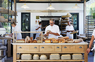
Exhibited: La Motte Tasting Room, Syrah Studio.

- Miershoop, SWA (Ant-hill, SWA)
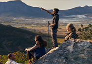
Pierneef is known as an artist who travelled extensively and explored, studied and interpreted his mother-country in various media on paper and canvas. Part of his expeditions during his early and developing years as an artist (1920’s) were three journeys — two to South-West Africa (Namibia, today) during, inter alia, 1923 and 1924, followed by his most influential journey to Europe, in 1925. During his Namibian journeys Pierneef created several works, mostly sketches, and chose ant-hills as his subject. The ant-hills have characteristics that can be compared and associated with ‘Pierneef mountains’. This is one of the linocuts with the ant-hill as its subject.
First print :1926
Other: Lithographic print produced by the magazine Lantern.
Exhibited: La Motte Tasting Room, Syrah Studio.

- Matala
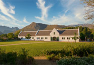
Pierneef had a strong interest in architecture. A few times he remarked that Cape Dutch was not true to South Africa, but that huts, built from stone, clay, reeds and grass were more suitable to the climate and topography of the country. Matalala / Matala / Matlalas (all the same place) is situated close to Pietersburg (Polokwane, today). There is a handful of oil paintings with huts as their subject, but Pierneef’s masterpiece for which the indigenous architecture and cultural reference were used as a source of inspiration, was his last home, named Elangeni (meaning ‘in the sun’, translated from Zulu) nicknamed ‘Die Kraal’ (‘The Kraal’).
First print: 1936 (considerably later than the most Pierneef linocuts).
Other: Lithographic print produced by the magazine Lantern.
Exhibited: La Motte Tasting Room, Syrah Studio.

- Waterpomp, Amatako (Water-pump, Amatako)
This linocut was created shortly after Pierneef’s journeys to Namibia, in 1923 and 1924. Of the 221 graphic works (etches, woodcuts and linocuts) by Pierneef (those that were recorded) twenty, almost a tenth, have Namibia as their subject. They feature several aspects of the landscape, especially trees, ant-hills and mountains.
Pierneef was not only an artist; he had several talents and enjoyed working with his hands — in a way he was also an engineer. He was interested in the functioning and assembly of machinery, therefore, in several media, one finds studies including mine-shafts, watermills and windmills as their subject. Pierneef also realized his character as ‘engineer’ or innovator in building and equipping Elangeni.
First print: 1925
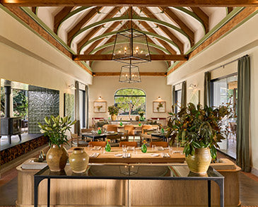
Exhibited: La Motte Manor House.

- Tweeling pieke, Stellenbosch (Twin Peaks, Stellenbosch)
Although Pierneef was of the opinion that Cape Dutch was not truly South-African, he did study the building style as a subject. Because the Cape Dutch style, particularly the gables, was very decorative, it suited his graphic work and use of line. Line is a very prominent element in Pierneef’s work.
Pierneef’s first journey to the Cape was in 1916 and his first solo exhibitions in the Cape, during inter alia 1921 and 1925, were held in Stellenbosch and Cape Town. Of the recorded 221 graphic works, 28 specifically featured the Western Cape mountains and Cape Dutch architecture. Most of the scenes are of the Stellenbosch and Tulbagh areas.
Since June this year, the record price for a Pierneef painting has stood at R20,5 million. The price was fetched by the oil painting Tweeling pieke naby Jonkershoek, Stellenbosch (1928). The painting and the Tweeling pieke, Stellenbosch linocut have the same scene as their subject. It is interesting that, when a Pierneef linocut and painting are based on the same scene, the linocut tends to be more decorative. In this case it is the other way round — Pierneef never limited himself to a specific order or style of creating.
First print: 1925 (one of the few numbered linocuts. Fifty were produced.)
Other: Scene for the Johannesburg Station Panel, Stellenbosch.
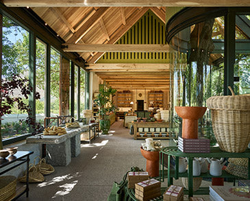
Exhibited: La Motte, Marketing Offices.

- Zebra
Pierneef had close friends in other art disciplines. Amongst others, they were authors, dramatists and film producers. As an artist who gained fame in the early 1920s, but struggled to earn a fixed income, Pierneef accepted contract work in order to supplement his earnings. The commissions included illustration work for newspapers, magazines and books. Most covers were created for the poet, his friend, JD du Toit (Totius). Zebra is one of three linocuts that were created for Andries Albertus Pienaar (Sangiro) — Afrikaans author and film producer. The linocut was done as an illustration for Sangiro’s first film, Klein Seebra.
Designed: 1938
Exhibited: La Motte, Reception.
The selection of twelve linocuts for the La Motte Pierneef Collection wine labels, therefore, interprets the story of an extraordinary South African master artist. The subjects and scenes featured in his work are generalised under the genre landscapes, though each subject comprises a wide frame of reference that gives indications regarding Pierneef’s development as an artist, as well as his interests and character.
Source: de Klerk, C & de Kamper, G. 2014. Pierneef in Print. Dream Africa: Limpopo. P. 2, 14, 56, 106, 150, 205.